Wedding Venue Booking Website Design
Will help making your special day more special !!
Project overview
The Wedding is a website for booking wedding venues , reception venues , photography and more.The typical user is anyone who wants to get married and start a happy life. The wedding goal is to make booking venues fun, fast, and easy for all types of users.
Year: 2020 - 2021
My role: UX designer designing website and app for The Wedding website from start to end.
Responsibilities:Conducting interviews, paper and digital wire-framing, low and high-fidelity prototyping, conducting usability studies, accounting for accessibility, iterating on designs and responsive design.
Problem : Wedding can be so expensive these days and websites are overwhelmed with so much unnecessary information so the people wanted a simple website to just book their wedding venue and happily get married.
Goals : Design a The Wedding website to be user friendly by providing clear navigation and offering a fast checkout process.
Design process
Research
I conducted user interviews, which I then turned into empathy maps to better understand the target user and their needs. I discovered that many target users want hassle free booking experience when they want to get married.
However, many wedding websites are overwhelming and confusing to navigate, which frustrated many target users. This caused a normally booking experience to become challenging for them, by making hard for them to find perfect destination for wedding
User research: pain points
1.Navigation:Wedding website designs are often busy, which results in confusing navigation
2.Interaction:Small buttons on wedding websites make venue selection difficult, which sometimes leads users to make mistakes
3.Experience:Online wedding websites don’t provide an engaging browsing experience
Problem Statement:
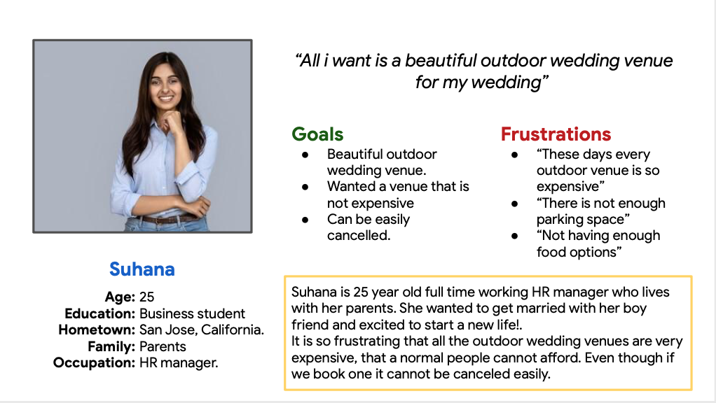
Suhana is a busy college student who needs intuitive website navigation and search filters because they want wedding to be stress-free.
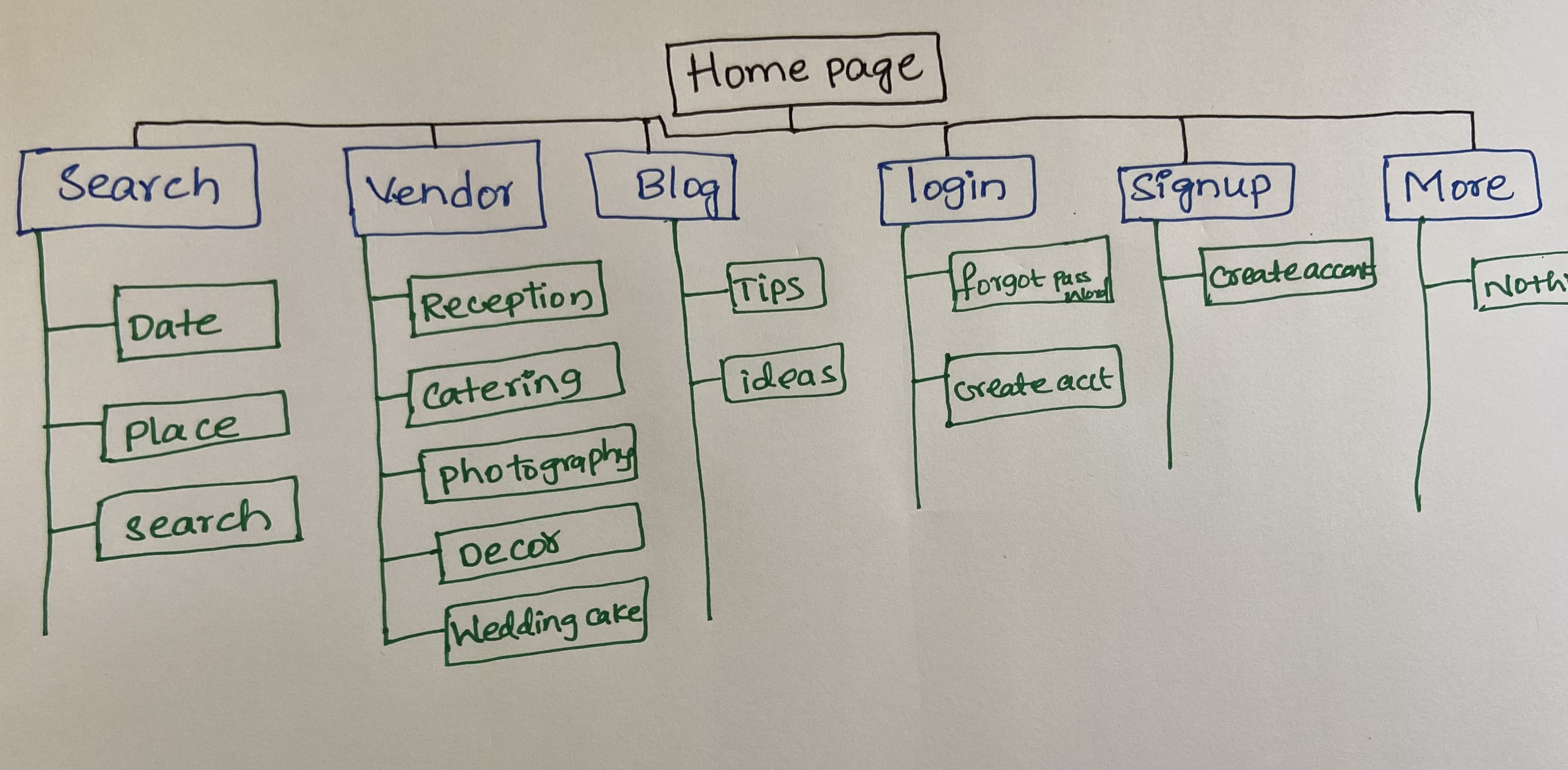
Sitemap
Difficulty with website navigation was a primary pain point for users, so I used that knowledge to create a sitemap.
My goal here was to make strategic information architecture decisions that would improve overall website navigation. The structure I chose was designed to make things simple and easy.
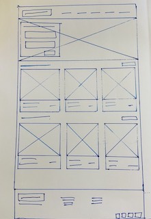
Paper wireframes
Done some Paper wireframes before doing any digital wireframes.
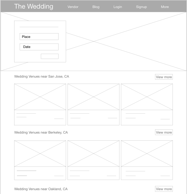
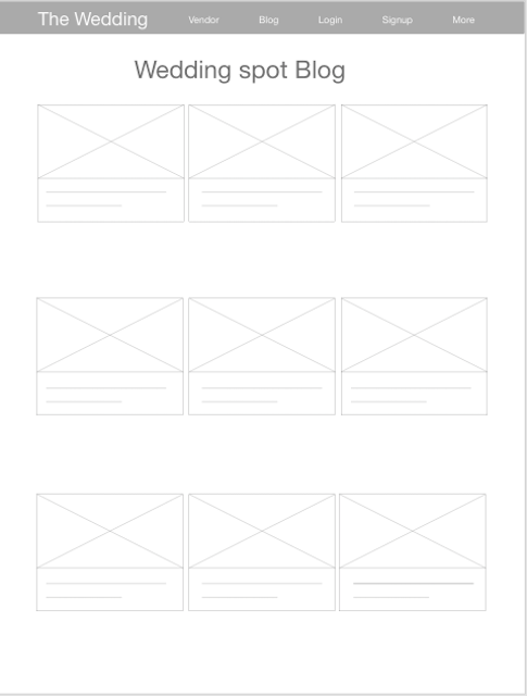
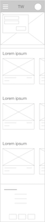
Digital wireframe screen size variations
Because The wedding customers access the site on a variety of different devices, I started to work on designs for additional screen sizes to make sure the site would be fully responsive.


Low-fidelity prototype
To create a low-fidelity prototype, I connected all of the screens involved in the primary user flow of adding an item to the cart and checking out. At this point, I had received feedback on my designs from members of my team about things like placement of buttons and page organization.
I made sure to listen to their feedback, and I implemented several suggestions in places that addressed user pain points.
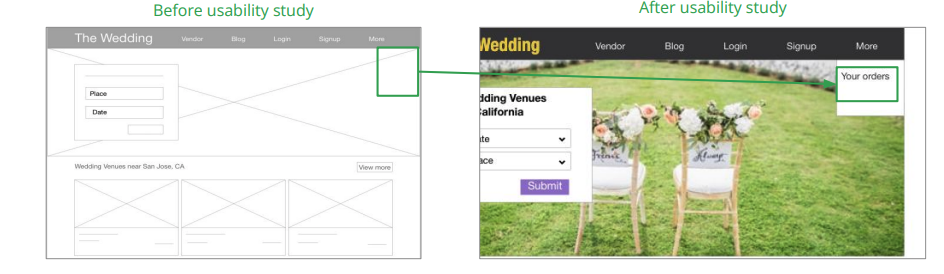
Usability study: findings
These were the main findings uncovered by the usability study:
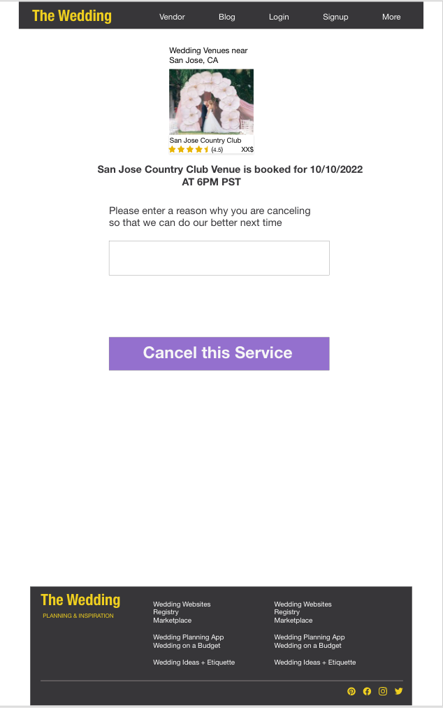
Cancel: Once at the venue is booked users wants cancel option if in any case the wedding is canceled
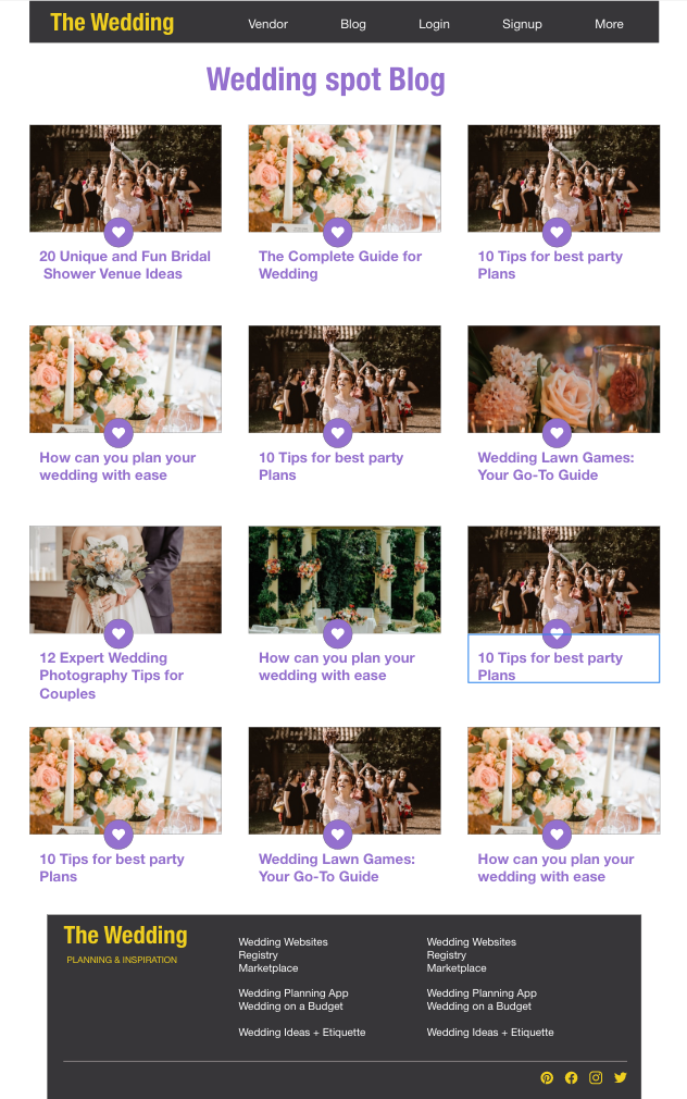
Blog:Users want a clean and clear tips and help instructions for the wedding
Mockups
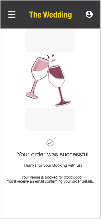
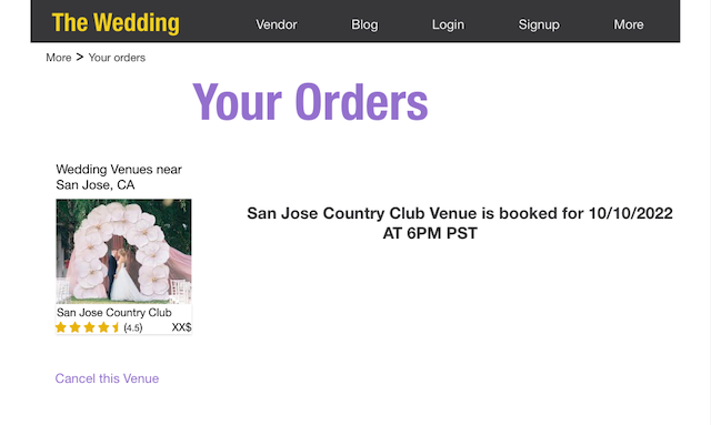
Based on the insights from the usability study, I made changes to improve the site’s cancel flow. One of the changes I made was adding the option to cancel the venue from user’s cart by going to Your orders and then from there they can go to cancel page easily.
This allowed users more freedom to cancel their venue without going through a complicated process to order or cancel venues.
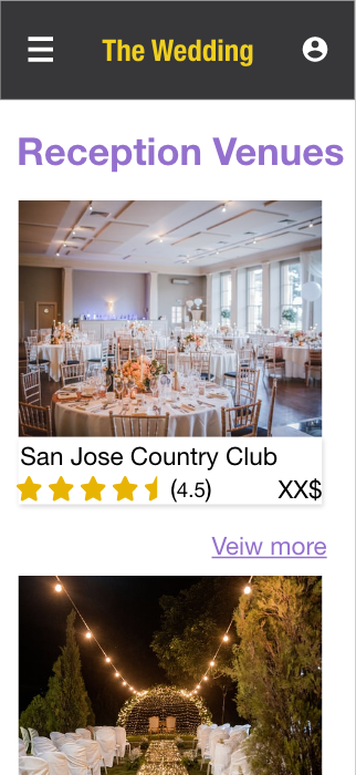
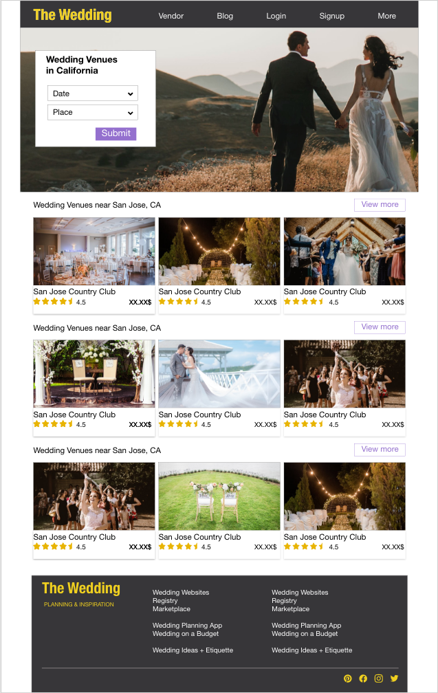
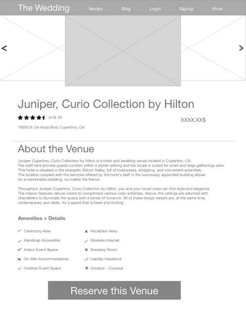
Key Mockups


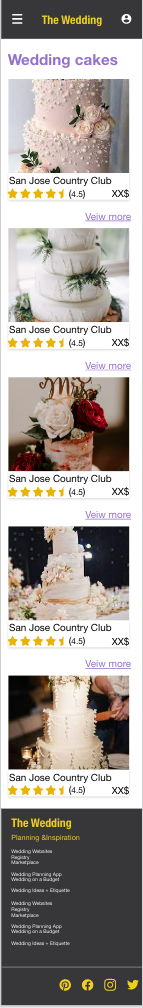
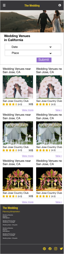
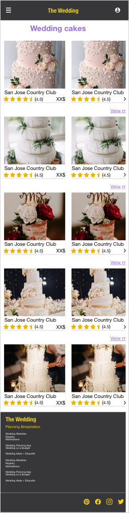
Mockups: Screen size variations
I included considerations for additional screen sizes in my mockups based on my earlier wireframes. Because users order from a variety of devices, I felt it was important to optimize the browsing experience for a range of device sizes, such as mobile and tablet so users have the smoothest experience possible.

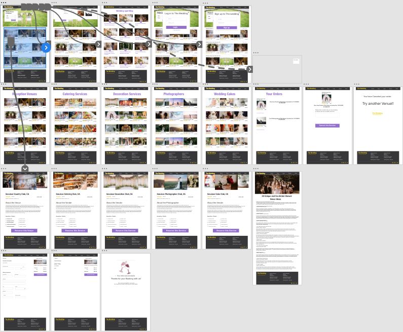
High-fidelity prototype
My hi-fi prototype followed the same user flow as the lo-fi prototype, and included the design changes made after the usability study, as well as several changes suggested by members of my team.
Here is the link to: High-Fidelity Prototype
Accessibility considerations
I used headings with different sized text for clear visual hierarchy
I used landmarks to help users navigate the site, including users who rely on assistive technologies.
I designed the site with alt text available on each page for smooth screen reader access.
Impact:
Our target users shared that the design was intuitive to navigate through, more engaging with the images, and demonstrated a clear visual hierarchy.
What I learned:
I learned that even a small design change can have a huge impact on the user experience. The most important takeaway for me is to always focus on the real needs of the user when coming up with design ideas and solutions.